
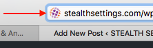
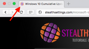
Favicon.ico – Website Icon in Browser
Before a website is launched, a graphic file is added, favicon, to appear in the browser, at the address bar. In most situations, Favicon is a miniature of the graphic logo or the initials of the respective website. This favicon is added to help users to identify a web address faster in Bookmarks.
Until recently this file had to be of shape “favicon.ico“, to be identified by the web browser. Chrome, Internet Explorer, Opera, Safari, Firefox, etc.
For several years, with the advancement of new web languages, Html9 and CSS3, favicon can be a fisier .png or .jpg. The condition is that in the website header, before </head>, to be present the line:
<link rel=”shortcut icon” href=”/images/favicon.ico” type=”image/x-icon” />
Website icon for iOS – iPhone, iPad si iPod Touch
In IOS We can add Shortcuts of web pages on Home Screen-uliPhone, iPad and iPod Touch.
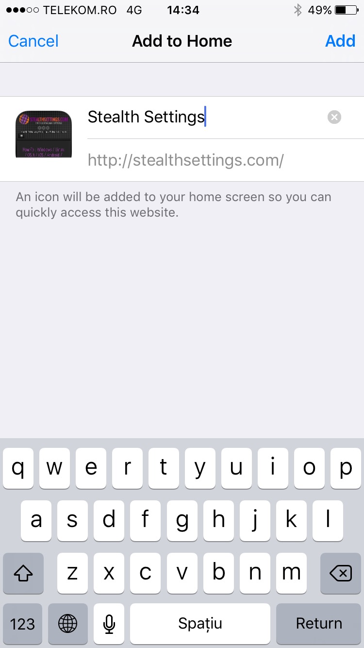
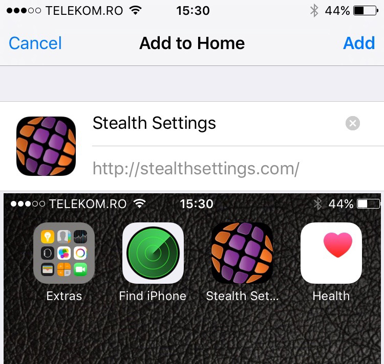
How do we add the shortcut of a website on the iPhone, iPad and iPod Home Screen
We do this by opening a web page on the iPhone (Safari, Chrome, etc. Internet Browser), we press on the square with the arrow (the sign for “share” in iOS), then the option “Add to Home Screen“.
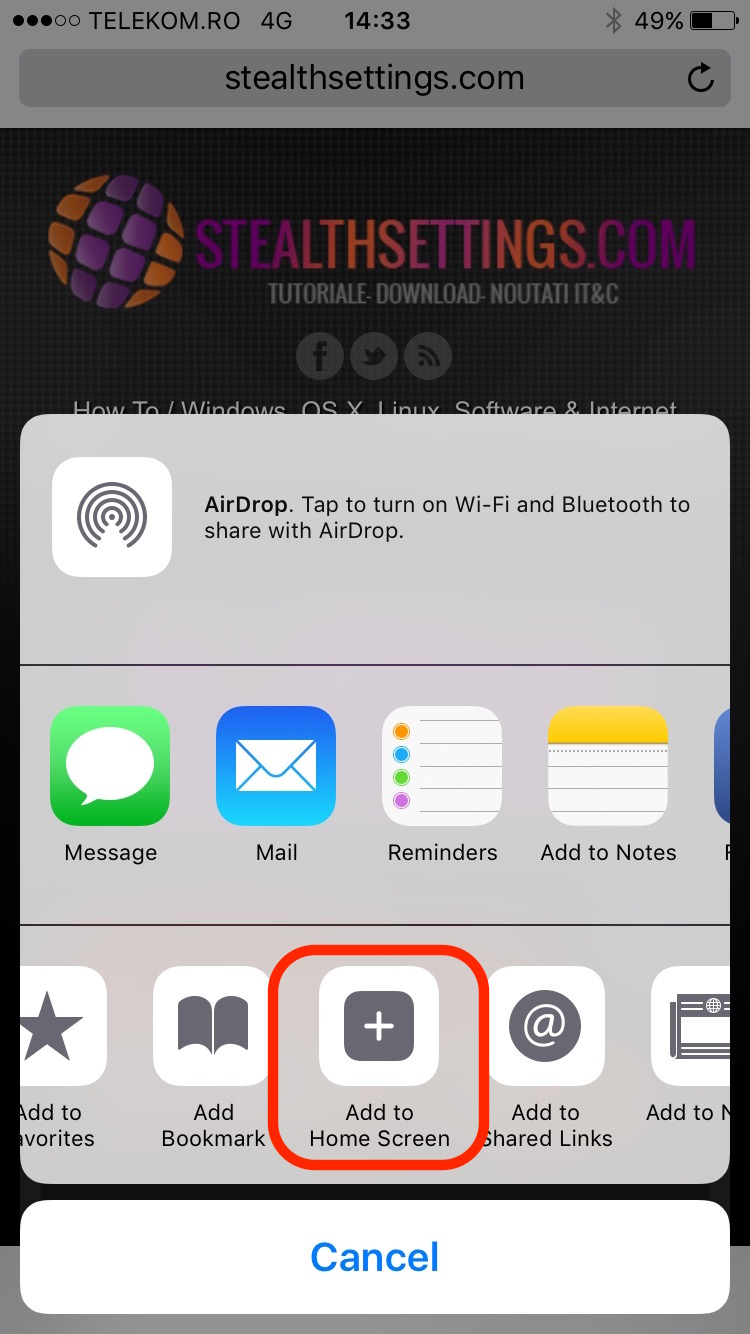
If the website has Favicon set for browser, but not set iconite specific to iOS devices, on the screen will appear an icon formed from a imagine preview of the web page.
How to add web icons for iPhone, iPad and Android.
The first step is hisWe create an image for iconita, which appears on Home Screenthe idea. In order for the web icon to be compatible on all devices and see clearly, we must create the image For all iPhone and iPad resolutions.
Standard resolutions and sizes of icons for iPhone, iPad, iPod and Android
- Classic iPhone / iPod / 57 models×57
- iPad = 76×76
- iPhone / iPod Retina = 120×120
- iPad Retina = 152×152
- iPhone 6/6S Plus = 180×180
Apple Update regularly Recommended dimensions for iconURLs applications and web pages on This page.
For Android devices, icons are two sizes:
- Android Classic = 128 × 128
- Android with high resolution (Hi-Res) = 192 × 192
After we have taken the images, we climb the web server, and in the HTML source of the website, before closing </head>, add the following lines:
<link href=”/apple-touch-icon.png” rel=”apple-touch-icon” /> <link href=”/apple-touch-icon-76×76.png” rel=”apple-touch-icon” sizes=”76×76″ /> <link href=”/apple-touch-icon-120×120.png” rel=”apple-touch-icon” sizes=”120×120″ /> <link href=”/apple-touch-icon-152×152.png” rel=”apple-touch-icon” sizes=”152×152″ /> <link href=”/apple-touch-icon-180×180.png” rel=”apple-touch-icon” sizes=”180×180″ /> <link href=”/icon-hires.png” rel=”icon” sizes=”192×192″ /> <link href=”/icon-normal.png” rel=”icon” sizes=”128×128″ />
For Apple devices, .png image name and “rel=” must contain the prefix “apple-“. For Android, file names will be “icon-hires.png” and “icon-normal.png” with rel =”icon”.
It is not absolutely necessary to create images for each resolution. You can make an image for the highest resolution, and the devices with a lower resolution will identify it and set it as an icon.
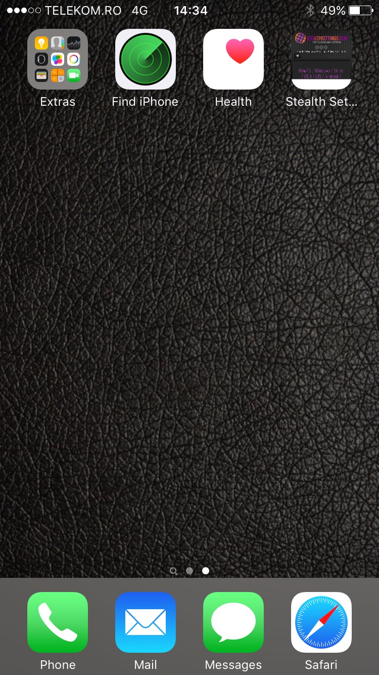
The Shortcut icon to the website will look like that of any Applications for iOS.
You may also be interested in...
