The new official Windows 8 logo

The official explanation a Microsoft for the drastic change of logo starting with Windows 8 operating system is that it was wanted return to origin this one, namely a window, and giving up the resemblance to one flag. At the same time, a visual association of the new logo with Metro interface of the new OS.
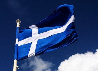
Although it is true that the logo used until now by Microsoft maybe he seemed somewhat outdated, although he suffered MODIFICATION – almost insignificant – from O version to another, and for newer users you have COMPUTER this one seemed a imitation unsuccessful a the Google Chrome logo, the new logo Windows 8 doesn't seem like a very inspired idea, considering its striking resemblance to Northern Cross, the flag of a Scottish province.

It can also be easily confused with the flag of the French city of Calais or al the Estonian city of Parnu, cu the old flag of Iceland or with the flag of the Greek Navy. And this in the conditions in which the old logo it was changed precisely because it looked too much like a flag.

And yet, although most likely there will be enough Windows users for whom it will not be too easy to get used to the Windows 8 logo (also with Windows 8 system) and maybe even more who will criticize Microsoft's decision to stop using the colors that a few years ago they considered to be components of spectrum of IT technology (for example we, in this article), we have to admit that the flag the Scottish province of Shetland brings more to the window than the old Windows logo. Q.E.D.
STEALTH SETTINGS – The New & Official Logo of Windows 8
The new official Windows 8 logo
What’s New
About Stealth
Passionate about technology, I write with pleasure on stealthsetts.com starting with 2006. I have a rich experience in operating systems: Macos, Windows and Linux, but also in programming languages and blogging platforms (WordPress) and for online stores (WooCommerce, Magento, Presashop).
View all posts by StealthYou may also be interested in...

